Doméstique Landing Page & Browsing
The objective is to improve conversions: from browse to completion of checkout, in order to increase revenue on the product’s web-experience. Their analytics show that users are not able to determine which bike is best for them, resulting in bouncing and abandonment. Doméstique needs a complete rebrand.
Doméstique is a fictional bike company, this prompt came from Bitesize UX as an E-Commerce Scenario.
Secondary Research and UX Planning
Beginning by examining industry specific companies - Trek Bikes, Canyon, and MerlinCycles - for common patters and user flows . I also examined larger companies that are known for high conversion rates - Target and Amazon - to gather any additional insights.
Hypothesis:
Users are unable to determine which bike fits their needs the best.
Why this is happening:
Our demographic of users are unlikely to invest unless they are confident in their decision.
What observation showed:
After browsing the site, many users either abandon their shopping journey or added a few bikes to their shopping cart and eventually abandon, without purchase.
What would help users:
To make confidence possible, Doméstique needs to assist the user by making it easy to find information about different bikes, be able to compare bikes, and help inform users who may be more novice to cycling.
With the current UX users are overwhelmed
With the goal of helping users find their bike, Doméstique needs some added features that would assist users narrowing down their options.
The new features are:
Help me Choose
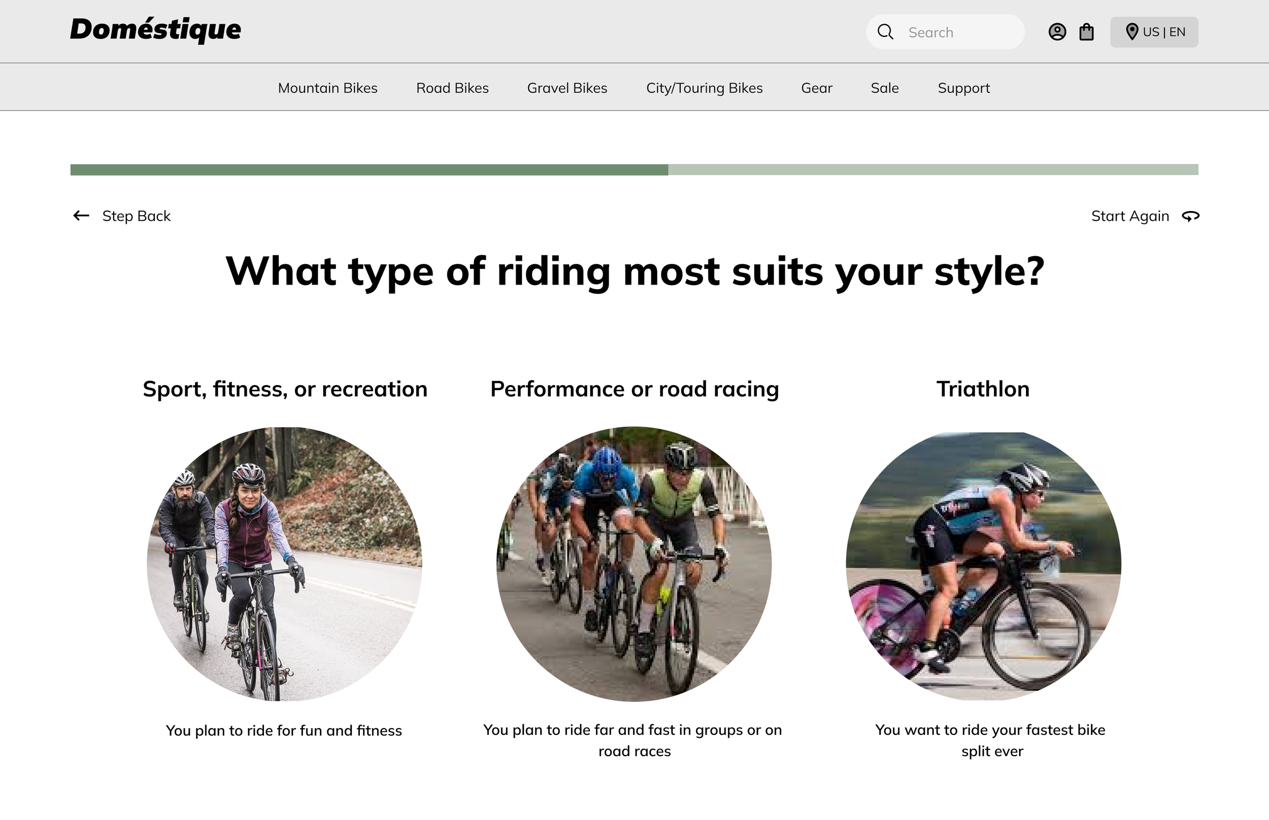
A quiz that uncovers what purpose the bike will serve for this user and direct them to a bike style that fits those needs.
Compare
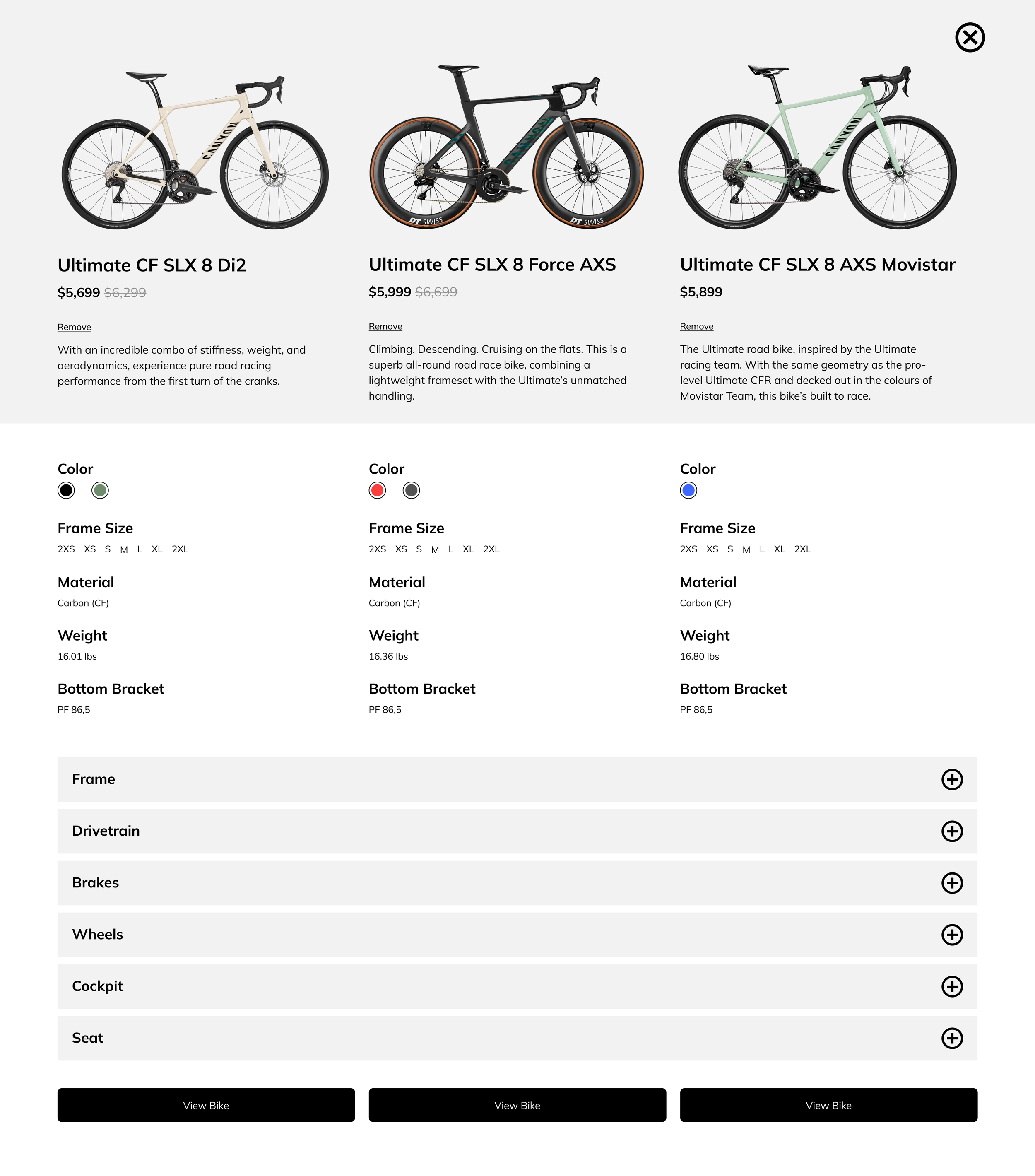
On each product card, there is a check box that allows the user to select that bike. The bike is then added to a bar that sticks at the bottom of the screen. Showing the user the name of the bike and price. Users are only allowed to compare three bikes at a time. Limiting their options will assist in decision making.
Original Wireframes of website
Hypothesis:
Users are unable to determine which bike is best based on relative features
Data shows:
50% of users open on average 7 item pages - abandon the site without moving any items into the cart
Data shows:
70% of users who place an item in the cart do not purchase
idea!
compare product features?
what other e-commerce sites do this well?
current bad UX
Right now, users must make an account to purchase
idea!
guest checkout to improve conversion?
guest checkout must capture email
Brand Personality
An expert in the field who is always knowledgeable about the very latest trends and best products related to biking
Brand attributes:
Savvy
Focused
Serious
Dependable
Design
I wanted to create something serious and dependable, that kept the focus on the product. I chose to keep the design simple and focus on images that depicted cyclists on different terrains and highlight successful cyclists as proof of product quality.
Doméstiques customers are highly invested in their gear and want to know the specifics. It was important for them to be able to find information quickly and compare one product to another.
There are also customers who want good gear, but do not know exactly what they are looking for. The Help Me Choose feature would ask a series of questions and take the customer directly to that Model page where they can continue to browse within bikes that fit their needs.
Homepage
walkthrough
Bike Comparison
Doméstiques customers are highly invested in their gear and want to know the specifics. It was important for them to be able to find information quickly and compare one product to another.
Bike Comparison
walkthrough
Help me Choose
There are also customers who want good gear, but do not know exactly what they are looking for. The Help Me Choose feature would ask a series of questions and take the customer directly to that Model page where they can continue to browse within bikes that fit their needs.
“Help me Choose”
walkthrough


