SaaS
Customer Relationship Management Software
GymBox
An iterative process
This is an on going project that you’re just seeing the beginning of. As the only designer I’ve gotten inspiration from Github, PostHog and various other references.
Treating any new project like a true beginner, in this case I really felt like one, I did all of the research and preparation I could think of. Many iterations occurred, and each time I learned something new and was able to adjust my view of this product.
I’ve designed enough for the GymBox Team to get this SaaS product ready for users, and there is much to come as we continue to expand its uses.
TEAM
Erin (Me) : UX Design Lead
Dillon : Co-Founder / CEO
Andrew : Co-Founder / CTO
Chris : Principle Engineer
IMPACT
Conducted Industry Research
Collaborated to design branding elements
Created High-Fidelity Designs for GymBox MVP
DESIGN TOOLS
Figma
Discord
PROBLEM
Gym Owners and Managers often have to use a mix of applications in order to run their gym effectively. GymBox wants to solve this problem and fill in the gaps to become the one stop shop for gym owners or individual fitness instructors. But we are starting small - the MVP includes taking payments through Stripe, using their API’s to create subscriptions and purchase options for classes or other products, member management, and member communications.
WHY THIS PROBLEM SPEAKS TO US
A mix of fitness backgrounds and a knack for problem solving sets apart the GymBox founders. Beginning, wanting to make the lives of owners, coaches, members and potential members fitness journey easy and more tailored to the individual.
We are building the ultimate and most complete set of solutions for gym business owners. We do this with the goal of making personal fitness the most accessible and enjoyable lifestyle change for everyday people as physically possible.
Stepping Into
Something New
Through experimentation and iteration I discovered what worked for GymBox dashboards - and what did not
Initial attempts at dashboard design for the home dashboard included exploring different layouts.
And
Attempts to include as many data points as possible, resulting in a crowded and confusing business health dashboard.
Preparing to design my first dashboard
Research on what should be included in different types of dashboards, observing competitors, getting inspiration from sites like Dribble, and considering what kind of visualizations and metrics would actually be helpful.
The goal is for gym owners to be able to see their dashboard and quickly find what they are looking for, understand that information, and know how that information will impact their next step. We want to deliver the data that matters to these owners and is easily digestible.
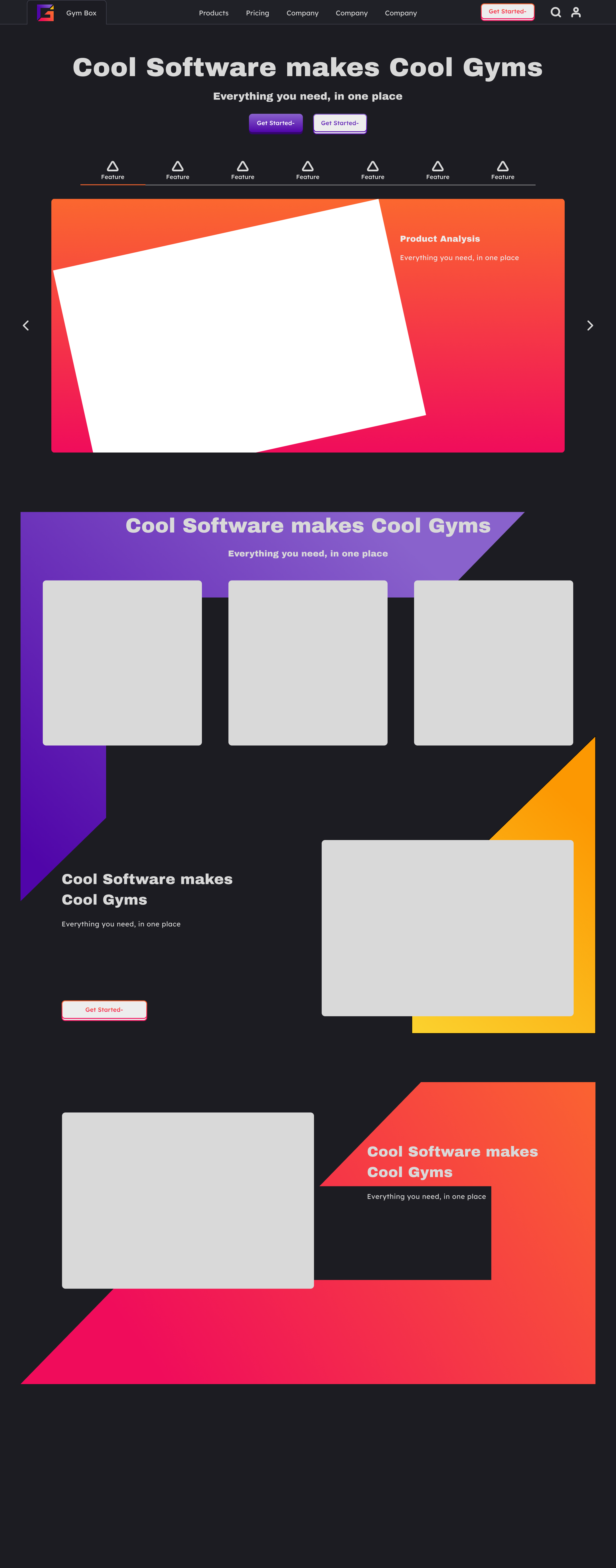
Landing Page
The Landing page was the first screen designed for this project. Experimenting with a dark and light modes in the cool toned pallet. As you can see it's not the perfect design. But it was the start I needed as a designer to put the pieces together for the UI Design. Playing around with a light version of the color pallet was good practice - but we are sticking with the dark pallet.


