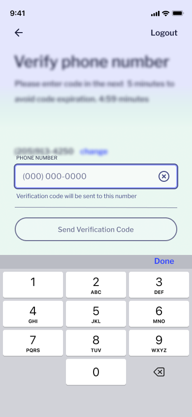
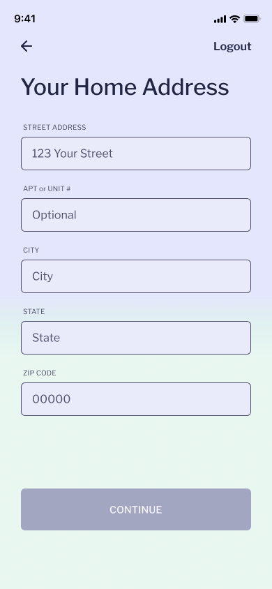
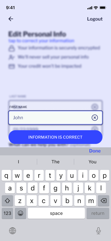
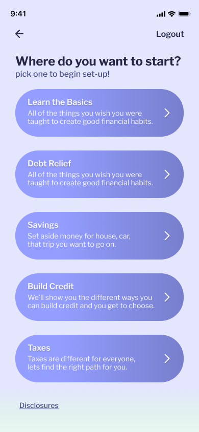
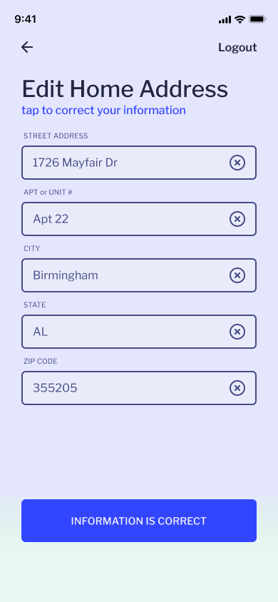
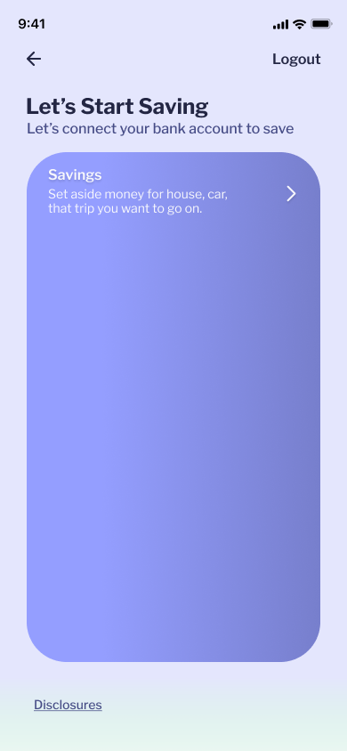
This is an update on the UI and Interaction design for Role Model’s onboarding process.
Things that were not working:
The input fields needed to be redesigned. This current design does not always work with the gradient shift of the background.
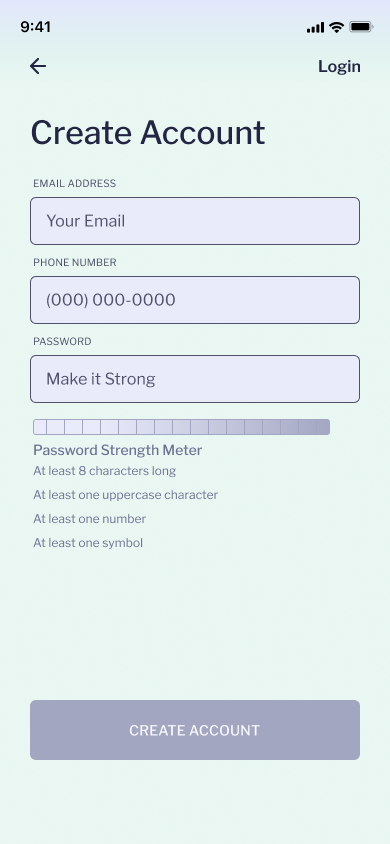
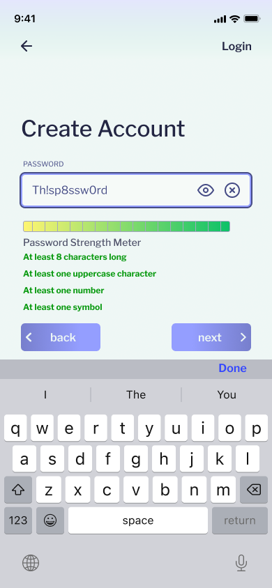
The placement of the Password Strength Meter needed to be changed. This placement is confusing and looks awkward.
The dropdown autofill takes up too much space on a mobile device and blocks the next input.
It requires the user to navigate to the “@” in their keyboard. The goal of the autofill is to reduce user fatigue while entering standard information.
Watch the video to get an idea of how this interaction works. The screen shots make it look very confusing.
This version of the navigation makes the screen look too crowded
Updated Interaction design
Significant Changes
Logo
The Company now has a logo combining Role Model’s initials R.M. in the silhouette of mountains and a night sky to signify the financial wellness journey as to that of climbing a mountain and reaching for the stars.
Email Autofill
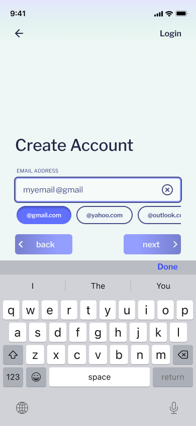
I like the idea of having an autofill for email, however the drop down takes up too much space and it requires navigating to the @ on the keyboard. The purpose of the autofill decrease time and effort it takes to enter basic information.
This step does seem like a lot of effort for not a lot of payoff since people who use 1Password or Google Password Manager already have the option to input their saved information.
It was still fun to design and think of solutions to make redundant steps easier for those who do not use Password Managers.
Instead of common email services being shown in a drop down once the “@” was inputted. They are now accessible in pill shaped buttons in a scrollable carousel which complete the email input when selected.
Navigation
Instead of tapping from input to input, you are able to use the next and back buttons to navigate. In the previous design, the inputs would transition to their active state and slide into position, above the keyboard. This allowed the user to see all the information required and easily navigate using “next” and “back” buttons instead of scrolling.
The issue that arose was spacing. Although the users understood how to use the next and back buttons, the spacing became cramped and I believe there is a better solution.
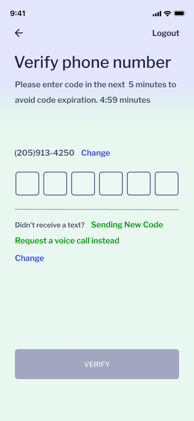
The navigation shows all of the information required in a section, just like the previous design. In the new design, when the first input in a section is selected the screen swipes. Only displaying the input, the next and back buttons, the keyboard, and the heading of the section. The next buttons takes the user to the following inputs until that section is completed and the process repeats for the following sections.


