Role Model - Simplifying User Onboarding
Scope: Onboarding Redesign for new Financial Wellness App
Role: UX/UI Designer - Concept, Research, Visual Design
Duration: 7 months
Tools: Figma, Miro
The Problem
Role model is a new financial wellness app that has been having a hard time getting new users. Based on their data, 45% of users who download the app do not make it through their onboarding process.
Role Model’s target audience is novice financial wellness app users. Their goal is to help people who want to increase their financial knowledge and support that at any level of financial education.
Through initial user research we were able to hypothesize the drop off point in onboarding. Novice financial app users are uncertain about handing over certain information, such as: social security number, drivers license, or bank account. They want to know they can trust this app and make sure it is useful to them before handing over their private data.
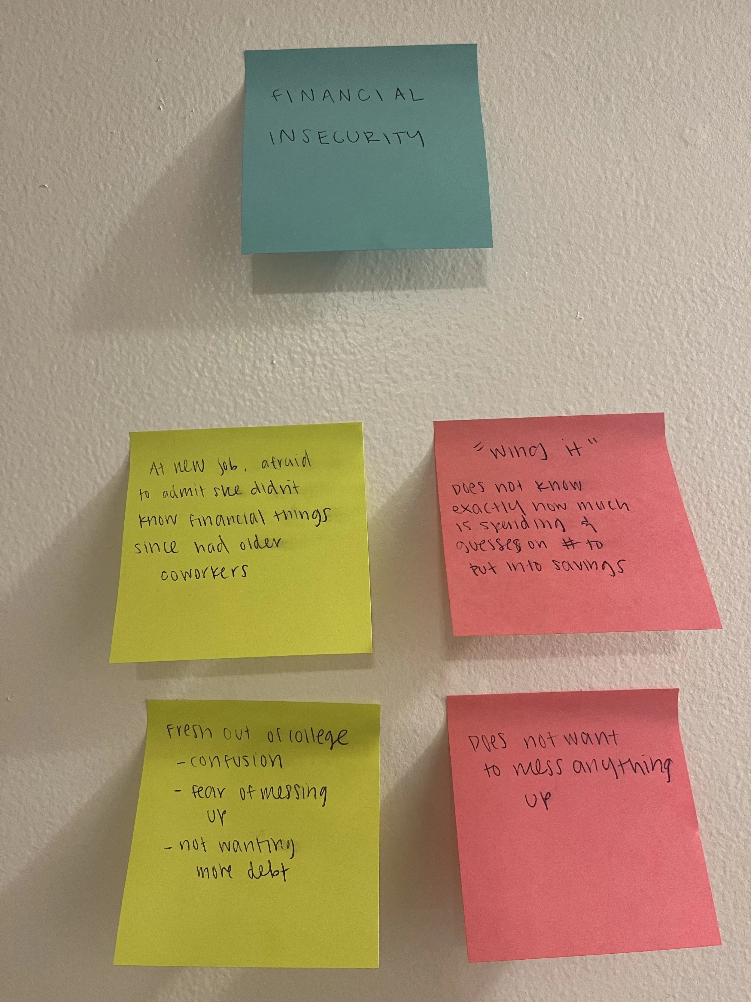
From talking to users, here are some common themes:
Fear of their financial future, that they are never going to make the perfect decision.
Some will “wing” their financial decisions and never really have a plan.
Most users were afraid to ask questions.
They will skip questions if they don’t view them as important or relevant.
Skipping questions users don’t see as relevant to the app also causes them to put incorrect information
Users have reservations about apps that ask for access to their bank accounts, without knowing why that access is necessary.
The majority of users would not give their information to apps that do free trials, because of past experiences.
Users want to know why apps need access to their bank accounts.
From the users perspective:
The onboarding was too long, preventing them from seeing what the app could offer them.
It made them feel uneasy being asked for information they didn’t feel safe delivering.
Mapping it Out
Not all of the users are going to be using tools that require bank access as soon as they download the app.
This allowed us to remove gathering of bank account, social security number, and drivers licenses from the onboarding. Instead, that information is gathered when it is relevant to the user’s needs.
The goal is to successfully get the user through account set up so they can personalize their financial education journey.
Guerilla Testing
Using paper sketches in Marvel to virtually do guerrilla testing.
Guerilla testing told me things that users preferred like:
The dial keyboard for numerical entries
Email @ autofill
Manually inputting address since autofill can get it wrong
Expectations of what would be done with their preferences
A skip button is not necessary
Navigation Design
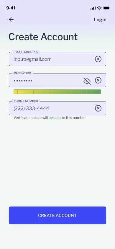
I chose an input system that would allow the user to tap around the screen as little as possible. First, showing the user every input needed in a section, then designing a screen for each input with a next and back button.
The user was prepared for the information they were handing over, and avoided frustration scrolling and tapping to get to the next input.
Adding a review information section allowed the user to make sure everything was correct, so they would not have issues later on. And, set the precedent that Role Model is focused on convenience and would give the user clear solutions.
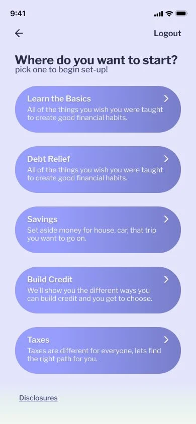
On the last screen, we see the beginning of the personalization process. Now that the user delivered all of the basic information for account set up, they immediately see different areas where Role Model can support them.
Design Iterations
Usability Testing
Usability Testing was conducted over Zoom in 30 minute sessions.
As the participant went through the prototype, I would give them scenarios to test my design.
Edge cases, such as: not receiving a verification text, not inputting a code in allotted time, and needing to edit information were all tested.
Feedback about the input field navigation, and features they did/did not see or decide to use, informed changed made in version 2.0
How it changed
Keyboard
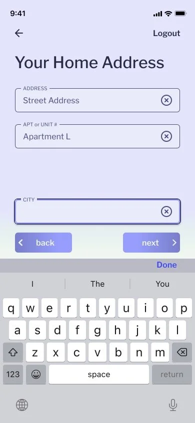
My goal of simple navigation was challenged when I realized how important designing around and for the keyboard was.
Including the keyboard forced me to change my design of how the user would navigate from input to input using as few taps as possible.
Address Input
On the Address Input screens there was the option to navigate to “Search Address” on a separate screen.
The initial goal was to find a way to cut out the step comparing the inputted address to the “found address”.
This went against my goals of simple navigation and findings in my discovery where the users said they would rather manually enter their address since search would not correctly find apartments or condos.
Progression Bar
Progression Bar was something my users did not care for. But was a feature that many of the competitors I was looking at would use.
As you go through this onboarding, the background changes from a pale green to a light purple. So that once you finish, the entire screen is the brand color.
Conclusion
Onboarding sets the users expectations for the rest of their experience on an app.
Convincing them that your app is reliable and trustworthy is key for any financial app. Users know that onboarding is something that they have to do, and some dread the experience.
Easing this frustration by: decreasing their effort needed to navigate to the next step, only asking relevant questions, and allowing them to easily review and edit their information will get them through onboarding faster. The goals is to make onboarding simple and easy, so they still have the desire to use this app.
The next steps to improve financial app onboarding, would be researching app demos that would be most useful.
I would also want to try this navigation approach to other types of apps. See what needs came up, and how to improve it.


